The Critical Elements of a High-Converting Landing Page
The vast majority of the people who visit your website will never come back, unless you can convince them to leave you their email address.
That’s where landing pages come in. Although marketers have a number of options to lengthen their email lists, such as in-line opt-in forms and pop-ups, landing pages are a great way to capture the information you need to nurture leads.
So, let’s look at what it is and how you can create one on your website.
What is a landing page exactly?
It’s a web page whose sole purpose is to get visitors to enter information in a lead-capture form. “Sole purpose” means the visitor has “no choice” but to scroll down the page and either opt in or leave.
To be clear, your website home page is not a landing page. The navigational menu at the top or on the side of the page only distracts your visitors from completing their goal, thus decreasing your conversion rate. Actually, this case study shows that you can increase conversion by up to 100% when you remove the navigation menu.
Marketers use landing pages to increase their conversion rate for a variety of initiatives:
- Pay-per-click campaigns
- Lead generation campaigns
- Newsletters
- Lead nurturing programs
- Social media programs
At first glance, you may think that creating a high-converting landing page is not rocket science: just put a couple of images together with a form and a bright red button. But you’ll soon realize that they require close attention to detail.
So, let’s review each of the key components of a high-converting landing page
1. The headline
Ideally, visitors should know instantly they’re in the right place. What’s your offer? Is it a report? An eBook? A cheatsheet? State it in the headline.
Also, make sure the language used in your headline matches the language used in the ad that led visitors to the landing page, thus maintaining what is called a “strong conversion scent.” Otherwise, it may feel like a broken promise and this will translate into a high bounce rate.
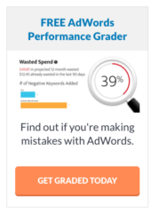
Let’s illustrate this with an example from WordStream.com. As you read some of their blog posts, you may come across this ad:

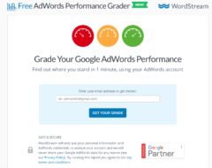
Click on it and you’ll land on this page:

Notice that the headline at the top “Free AdWords Performance Grader” matches almost word for word the ad that promised a FREE AdWords Performance Grader.
2. A sub-headline
Similarly, the sub-headline of your landing page should focus on the primary benefit of opting in.
Buying is always an emotional decision, even in B2B, where you're marketing to a group of people. #B2BMarketing Click To TweetNumerous studies have shown that the strongest emotional drivers are the desire to eliminate pain and the desire to increase pleasure. So try to leverage at least one of these emotions in your sub-headline.
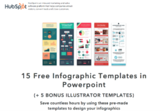
For example, on this landing page, HubSpot offers some infographic templates promising “to save countless hours”:

3. Compelling copy
Once you have an irresistible title and sub-headline, you need to clearly state the benefits of opting in.
Going back to HubSpot’s infographic offer, you’ll see the copy is articulated around three key elements:
- Why you need infographics (with the stats to back up the claim)
- The problem with creating infographics (time resources)
- The easy solution (HubSpot’s templates)

Here, HupSpot decided to present the compelling story in three easy-to-digest paragraphs, but you could use a numbered or bulleted list to help busy visitors skim through the benefits.
Another aspect to consider for your copy is whether you want to use “social proofs” in the form of testimonials to increase credibility and trust. This is particularly effective if the positive feedback comes from an industry influencer or confirms that you delivered on your promise to save time, money or both.
Add social proofs to your #landing pages to increase conversion Click To TweetIf you’re starting from scratch, you have the option to add a short introductory paragraph about the report’s authors. Think of it like a speaker’s bio at a conference. What makes them experts on this topic? Can you name some of their key accomplishments? Be creative (but honest). Even if the author is not the most famous, you could say that the report includes tips from credible experts he or she interviewed.
4. Visual representation of your offer
Now that you’ve spent all this time on coming up with an irresistible headline, sub-headline and copy, you don’t want to ruin it with an unprofessional design.
A good web designer can help you figure out the right font and font size, colour scheme, and optimal layout, without having to spend a fortune. A professional will also create personalized images, which are much better than stock photography.
Generally speaking, visitors like to see what they’re about to get. For eBooks, whitepapers and reports, landing pages typically display the cover page, but why not go the extra mile and feature a one- or two-page excerpt?
5. Call-to-action button
No landing page would be complete without a call-to-action button. To make it stand out, feel free to use bright colours, large fonts and lots of white space. As surprising as it may sound, simply changing the button colour may lead to a 21% increase in conversion rate.
Similarly, pay close attention to the words you use on the button. Action verbs and specific wording that conveys value tend to perform better in terms of conversion rate than generic copy.
Test different colours and wording on your #landingPage Click To TweetNotice that unlike HubSpot, which opted for a general “download NOW” copy (all caps) that could be used for any offer, WordStream uses “Get Your Grade,” and Unbounce uses “Download the report for free,” thus reinforcing the value promised in the headline and sub-headline.
6. Lead-capture form
This is arguably the most important aspect of your landing page as it enables you to collect essential information.
You typically have to consider three key aspects:
- The placement of your form (above the fold is best practice)
- The length of your form (shorter is better, but it should be proportional to the value offered)
- Mobile responsive design for optimal display on smartphones
It’s your turn
For the purpose of this post, we’ve focused on key aspects of a high-converting landing page in a B2B context, but if you’re looking for best practices for e-commerce websites, you’ll need to consider other important aspects such as creating a sense of urgency with a limited time offer and adding trust symbols like SSL encryption.
Are all these rules set in stone? No. Ultimately, you’ll need to run A/B tests to determine what works for you, but like Pablo Picasso said:
Learn the rules like a pro, so you can break them like an artist.
We’re always looking for examples of amazing landing pages, so feel free to share in the comments section which page deserves to be mentioned and why.
Related Services
-
Email Newsletters
Create engaging newsletters that maintain a personal connection with your leads and contacts.
-
Web Copy Writing Services
At bNurture, we offer web copy writing services that ensure each and every page of your website is written with the reader in mind.
-
Website Project Manager
